A refresh for a dynamic audience
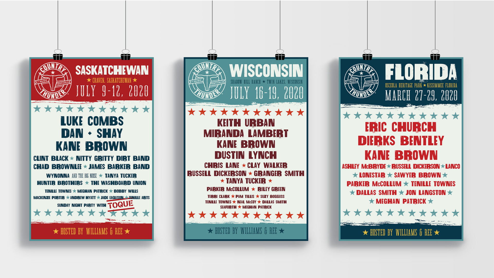
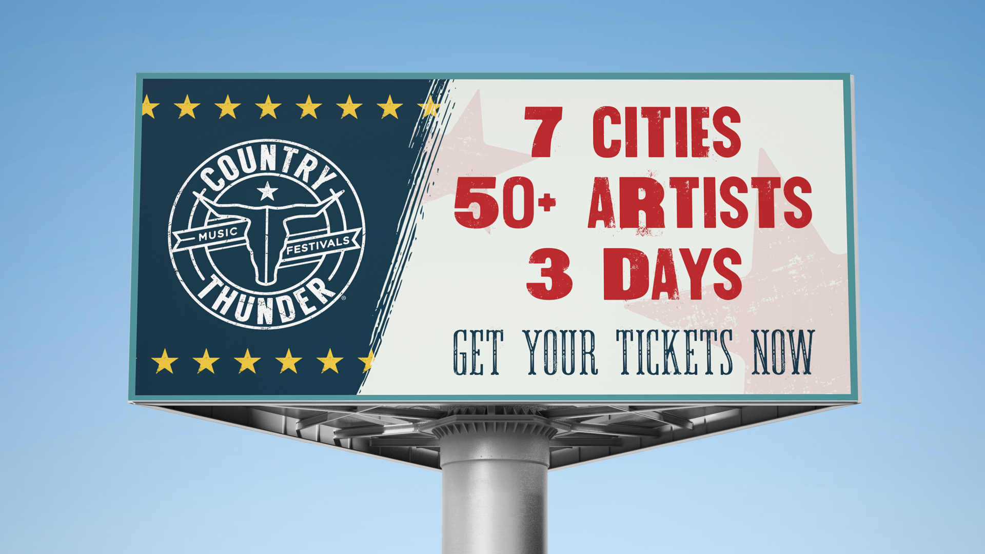
The purpose of this project was to give this music festival a brand refresh. The client requested to keep the current logo, but incorporate new branding elements such as color, typography, and lineup posters.
Services Provided:
Visual Identity
Social Media Design
Print Design

Visual Identity
We took inspiration from old printed posters and Hatch Show Print. The colors were inspired by old Americana with a modern take. We wanted to highlight the roots of country music, yet make it feel fresh and elevated.


The Approach
It was important to recognize that this branding had to work across multiple platforms. Whether it was digital, or printed it needed to feel strong and grounded.


Credits
CREATIVE DIRECTION: Chris Gregoire
ART DIRECTION: Kathryn Kelner
Work was produced while employed at (and copyrighted by) Gupta Media.