Taking sustainability to the next level
What started as a dream, quickly turned into a reality. Fleurish is an annual runway show with the purpose of informing the Knoxville community of the ways sustainability, conservation, and beauty intertwine with our life and our future.
When it came time to bring this project to life, the visual identity needed to be strong. We worked hard creating a brand that would capture our audience and kick off the first year of the event.
Services Provided:
Visual Identity
Digital Marketing
Print Design


Visual Identity
The name Fleurish came from an idea of mixing sustainability and adding something unconventional to it. The look and feel needed to stand out, while still holding onto this soft nature aspect of the event.
The visual identity of Fleurish began with the creation of the logo. We worked with multiple typefaces, but landed on this bold serif font and paired it with an effortless script. From there the colors fell into place. We added in some additional secondary colors to play off the primary colors driving the brand.


The System
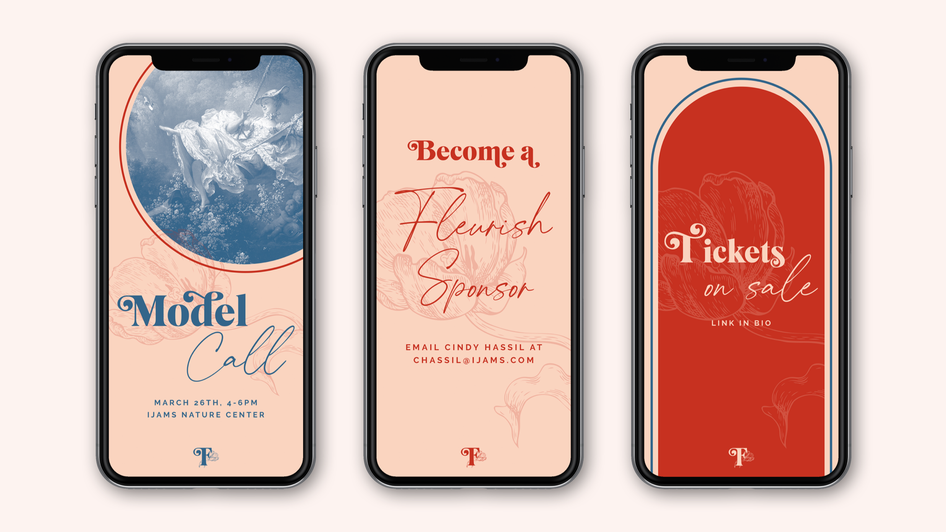
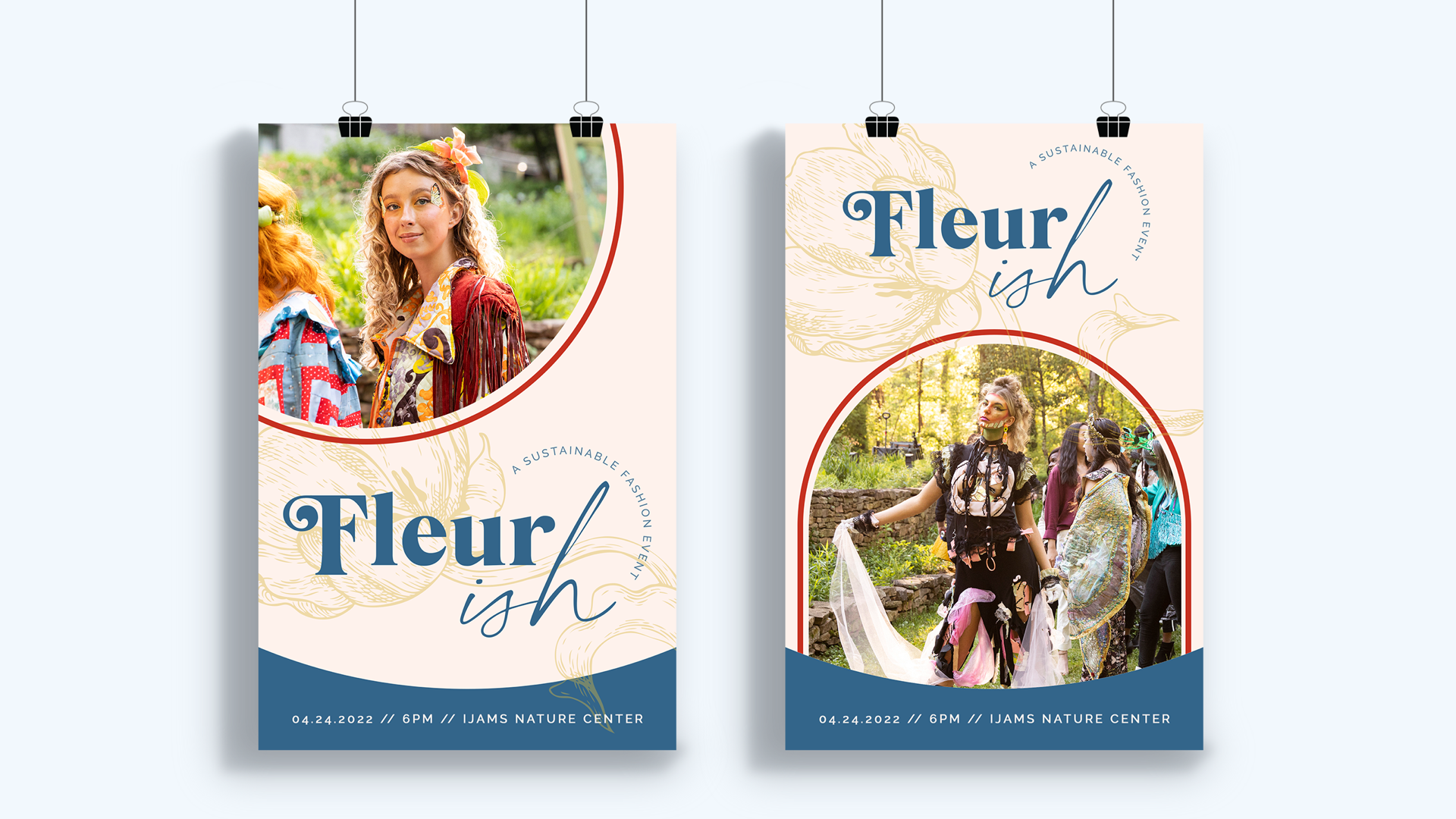
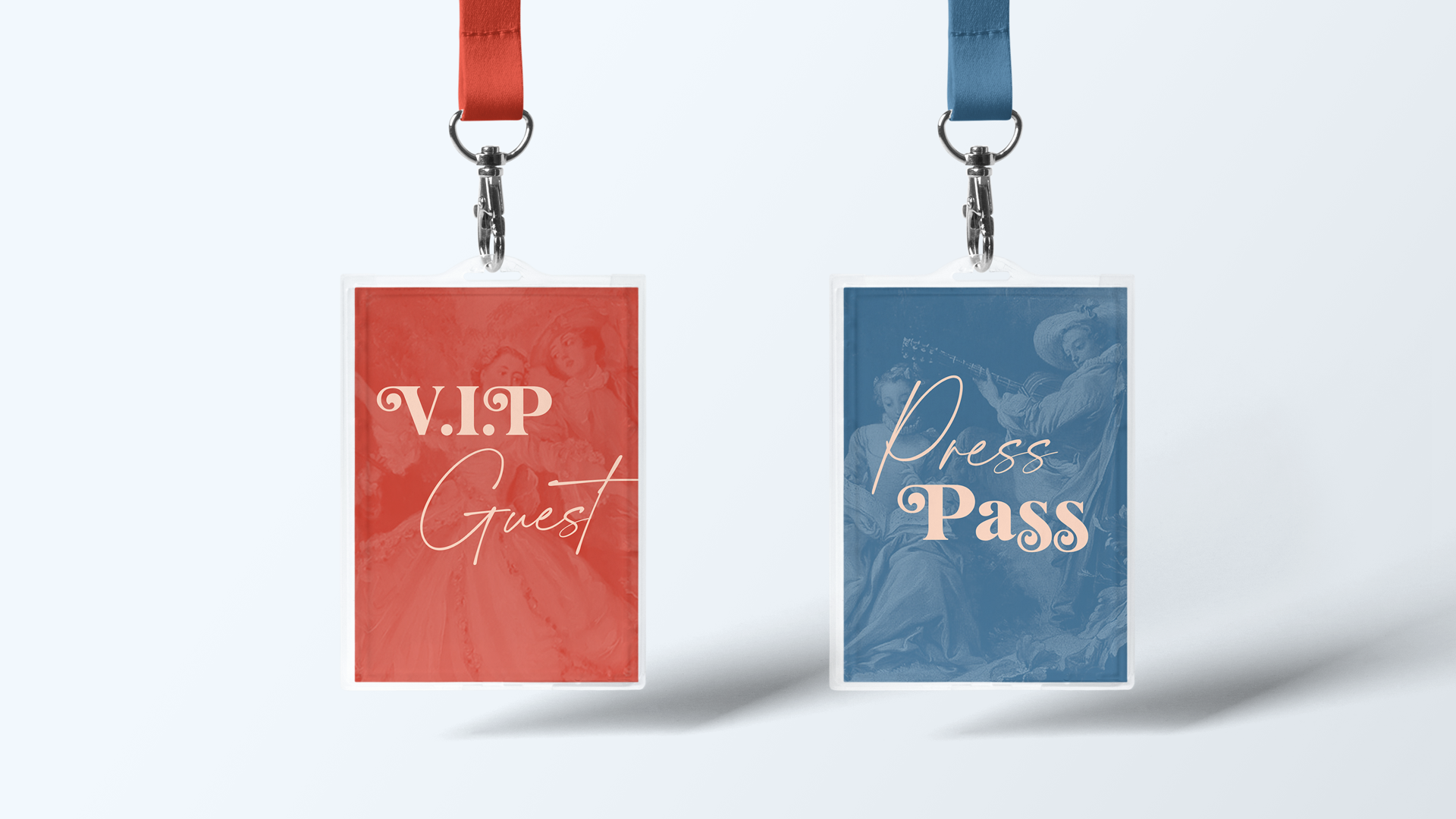
Once the visual identity was finalized, we began building out brand collateral. Social media would be our main form of communication, so we worked on creating engaging posts to interact with our followers. We also wanted our day of product to be informative, but flow within the event space.


Credits
CREATIVE DIRECTION: Ben Prager
ART DIRECTION: Kathryn Kelner
PHOTOGRAPHY: Kate Nguyen